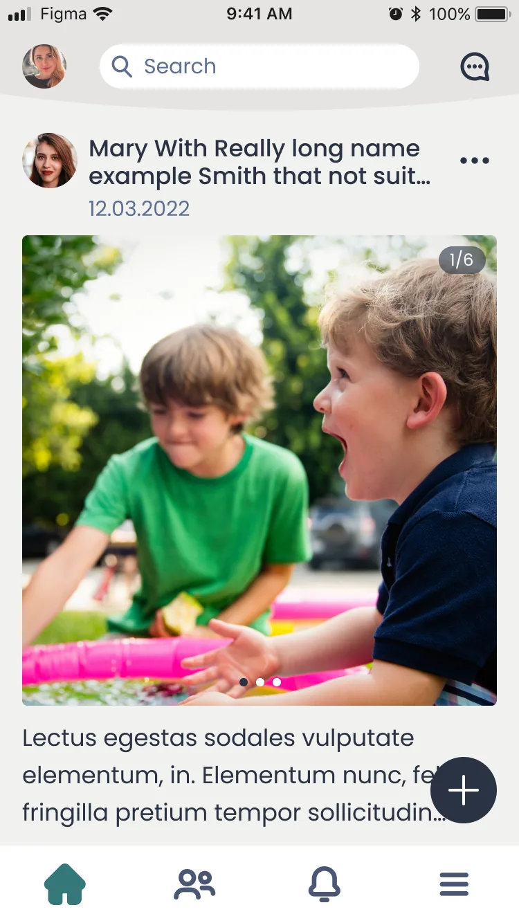
Context & stakes
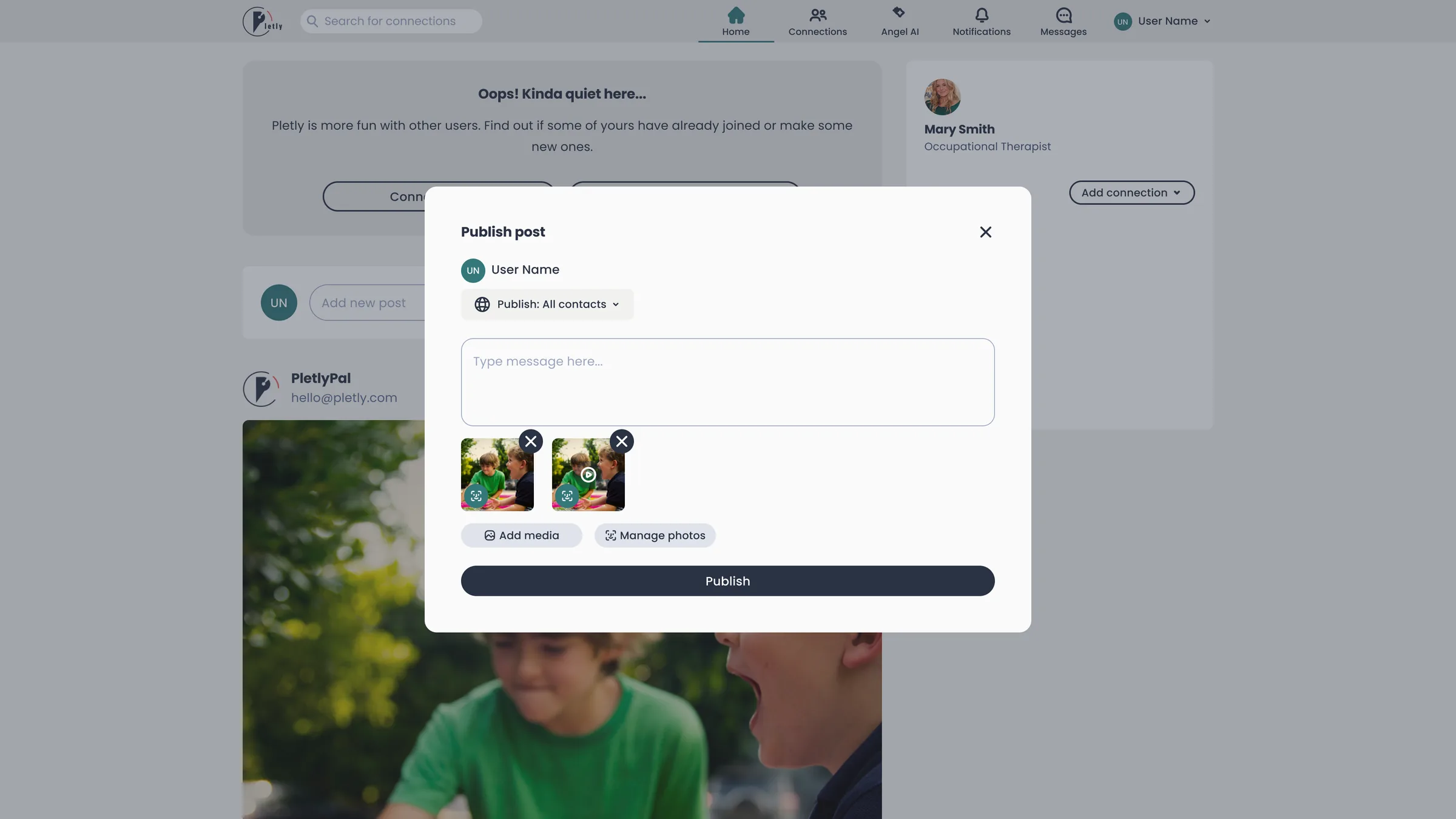
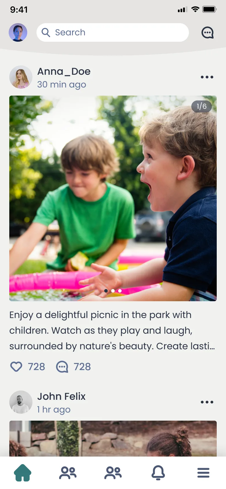
Pletly connects caregivers and families around personalized care, partnering with Bancroft and Innovation Norway. High onboarding drop-off was inflating support load and slowing growth, right when the founder needed traction proof for investors.
The problem
The critical onboarding flow leaked users, and accessibility gaps excluded part of the exact audience a care platform exists for.
My role & decisions
- First and only designer on the product, building the design language from zero.
- Worked directly with the founder: scoping, prioritizing and shipping in short iterative loops.
- Key decision: accessibility as a core constraint, not a checklist afterthought. Onboarding became one decision per screen, with large touch targets, plain language and no time pressure, because a share of caregivers and care receivers are older users the standard mobile patterns quietly exclude.
- Extended beyond product: designed the graphics and materials used in fundraising.
Process
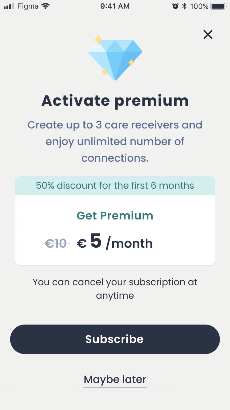
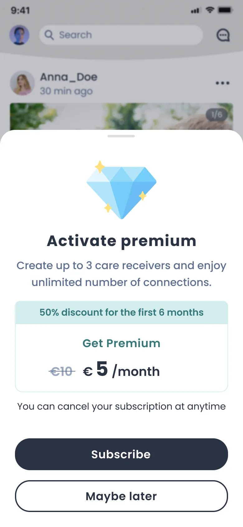
I traced where onboarding actually leaked by walking the flow with the founder and reading support conversations, then rebuilt it screen by screen in short loops: cut fields, split compound decisions, rewrote every label in the language caregivers use. Each iteration went straight into the app, so we validated with real signups instead of test scripts. The same system then scaled from mobile to the web app without redesigning it twice.